Thx for the effort, but: I already discovered more than is shown on your map, I think! going left, I followed the first tunnel I found - and found an exit into the open. Could not find that on your version at all. Is xkcd changing tiles?
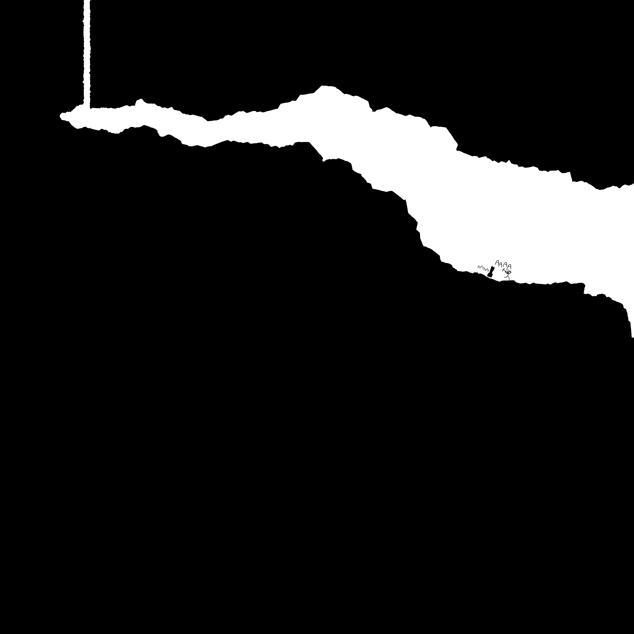
In the original, the supposedly black tiles were actually just missing images, allowing the black background to show through. That's why they're white here. The author has used a solid background for the whole map, instead of having a black background for the bottom half.
I had this master plan of putting it into a webpage and using some sort of screen-print extension or JS to save it as one huge image. But as of now I've now spent more time on the capture part of it than I did on the initial scripts to grab the files and render them out in JavaScript, and need to get back to work instead.
If this helps anyone get closer to a full image, please post the result!
Dropbox says "This account's public links are generating too much traffic and have been temporarily disabled!" so I put a backup on Cloud app: http://news.ycombinator.com/item?id=4543626
This was as big as I could get it before my computer started to grind to a halt, but it's more of a demo of how little code it takes to do this sort of thing in AngularJS than anything else.
Took me away from building http://goodfil.ms for about 40 minutes all up.
After 45 minutes, my index fingers are absolutely warn out from using a trackpad. I really wish he would have made it navigable by more than just click & drag. I do wish this was more thorough, though.
To me that's why its so magical. Its actually expensive in time and effort to navigate, so you feel like you're investing something in order to explore. This also means that its difficult to see every part of the image, so you're left with a sense of frontiers yet unexplored when you navigate away from the page. The zooming versions are cool but, to me, actually take away from what Randall is trying to achieve here.
I thought that it was the "click" part of the original navigation that really frustrated me, rather than only seeing a little bit at a time. I gave up on the original in a few minutes because my hands/wrists were aching after using a touchpad and then a mouse
I used the zoom versions after the fact primarily so I could swipe to look at the original 1:1 more comfortably, and then only later to follow up on what I thought (correctly) was just a bunch of blank space. Clicking to drag specifically really dampened my enthusiasm for going off in random directions to investigate the whole thing.
I think it still works with zooming because the scale is so extreme that it leaves you wondering whether a tiny smudge is worth zooming in on. And once you zoom in far enough to read the text, the surrounding objects look as big as they're meant to be.
Creator of Plunker here. Big thanks to the Nodejitsu and Mongolab folks whose services are strong enough to compensate for my crappy code being hit by a Hackernews assault.
I must be missing the point to this because I'm having a "huh, cool? move on moment"; but it's the top item on the front page right now. Can someone shed some light at what I'm looking at?
http://xkcd-map.rent-a-geek.de/